Please forgive me, APEX Community, for I have sinned. It has been 24 months since my last blog post… But I’m still here, following you, reading you, and appreciating all your great advice and ideas!
Am loving apex.world, my one-stop shop for all things APEX related. It’s made me feel like I want to be contributing in some small way, so I thought I would share my recent experience with FusionChart and Oracle APEX integration.
Some of you may know that for the past few years, in addition to my APEX work, I have been running an online reading log/reading incentive program built with Application Express. We now have over 200,00 users worldwide, and we try adding new features every year.
This year, our big update was a School Account, that would allow subscribers to run reading challenges between 2 classes, as an incentive to get the kids reading more.
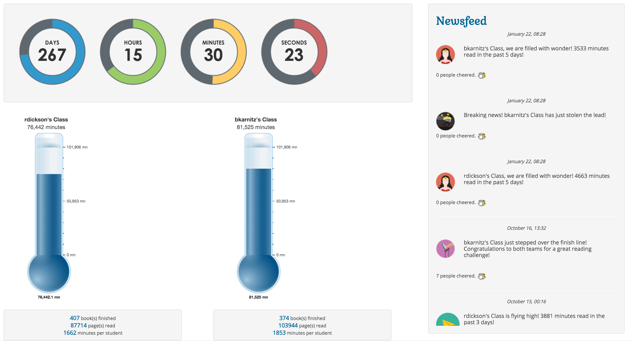
We wanted our Challenge page to be really visual, a place the kids would want to keep coming back to. This is the final result, with a countdown timer (post to follow), a Newsfeed that automatically populates based on various triggers that kids could engage with (post to follow), and Thermometer Gauges representing amount read.
We knew we wanted to represent Minutes/Books/Pages read as thermometers, the kind you see on various fundraising pages. At the time we were developing this, AnyChart did not have a Thermometer Gauge ready, and none of the other chart options thrilled us. So I played around with the FusionChart Thermometer gauge, and really liked it. So we decided to bite the bullet, purchase the license and set it up.
It really couldn’t be easier to get this working, and FusionCharts actually has great online documentation. Playing around at JSFIDDLE helped a lot too.
1. Add references to JS files
The first step was adding references to the required javascript files. I did this by adding to the APEX page template for the page I was using.
<script type="text/javascript" src="/jquery/fusioncharts/js/fusioncharts.js">
</script>
<script type="text/javascript" src="/jquery/fusioncharts/js/themes/fusioncharts.theme.fint.js"></script>
2. Add an HTML region to your page, that will be the container for the chart
I actually have two of these on the page, one for the ‘Challenger’, and another, for the group getting challenged. But you need one per gauge you are displaying, each with their own id, of course.
I made sure I selected ‘No Template’ as Region Template.
<div id="Challenger">FusionCharts will render here</div>
3. Create a procedure that will return the HTML necessary to render the thermometer data
JS Fiddle tells me my Thermometer source data needs to look something like this, for the default settings.
FusionCharts.ready(function () {
    var chart = new FusionCharts({
        type: 'thermometer',
        renderAt: 'Challenger', -- id of the region I created in Step 2
        id: 'temp-monitor',
        width: '120',
        height: '400',
        dataFormat: 'json',
        dataSource: {
            "chart": {
                "caption": "Central cold storage",
                "subcaption": "Bakersfield Central",
                "subcaptionFontBold": "0",
                "lowerLimit": "-20",
                "upperLimit": "20",
                "numberSuffix": "°C",
                "bgColor": "#ffffff",
                "showBorder": "0",
                "thmFillColor": "#008ee4"
            },
            "value": "-10"
        },
        "events": {
            "rendered" : function (evtObj, argObj){
                var intervalVar = setInterval(function () {
                    var temp = -10 + parseInt( Math.floor(Math.random() * 6), 10);
                    FusionCharts.items

						["temp-monitor"].feedData("value="+temp);
                }, 3000);
            }
        }
    })
    .render();
});
Obviously I want my thermometer to reflect the minutes, pages or books read by the kids using the program, so my procedure looks something like this
procedure minutes_gauge (p_challenge_id in number, p_id_group in number) is
begin

declare

v_upper_limit number;
v_caption varchar2(300);
v_subcaption varchar2(400);
v_value number;
v_value_challenger number;
v_value_challengee number;
v_challenger_id number;
v_challengee_id number;
v_render varchar2(20);
cursor c1 is select * from rr_challenges where challenge_id=p_challenge_id;
cursor c2 is select group_name from rr_groups where id=p_id_group;
challenge_rec c1%ROWTYPE;
group_rec c2%ROWTYPE;

begin

 OPEN c1;
 FETCH c1 INTO challenge_rec;
  OPEN c2;
 FETCH c2 INTO group_rec;

/* a whole section here that you don't need that calculated the different
variables i need for my chart. Adapt to your needs.
Once I fetch all my data into the variables, all that is left it to render
the chart */


htp.p('<script>
FusionCharts.ready(function () {

var chart = new FusionCharts({
        type: "thermometer",
        renderAt: "'||v_render||'",
        id: "'||p_id_group||'temp-monitor",
        width: "215",
        height: "500",
        dataFormat: "json",
        dataSource: {
   "chart": {
      "caption": "'||group_rec.group_name||'",
      "subcaption": " '||to_char(v_value,'999G999G999G999G999G999G990')||' minutes",
      "lowerLimit": "0",
      "upperLimit": "'||v_upper_limit||'",
      "decimals": "1",
      "numberSuffix": " mn",
      "showhovereffect": "1",
      "thmFillColor": "#008ee4",
      "showGaugeBorder": "1",
      "gaugeBorderColor": "#008ee4",
      "gaugeBorderThickness": "2",
      "gaugeBorderAlpha": "30",
      "thmOriginX": "100",
      "chartBottomMargin": "20",
      "valueFontColor": "#000000",
      "theme": "fint"
   },
   "value": "'||v_value||'",
   "annotations": {
      "showbelow": "0",
      "groups": [
         {
            "id": "indicator",
            "items": [
               {
                  "id": "background",
                  "type": "rectangle",
                  "alpha": "50",
                  "fillColor": "white",
                  "x": "$gaugeEndX-40",
                  "tox": "$gaugeEndX",
                  "y": "$gaugeEndY+54",
                  "toy": "$gaugeEndY+72"
               }
            ]
         }
      ]
   }

}

    })
    .render();
});
</script>');

end;
end;
4. Add a PL/SQL region to my page that calls the procedure
The last step is to simply add a PL/SQL region to my page. The source looks something like this:
minutes_gauge(:P_CHALLENGE_ID,:P_CHALLENGER_ID);
And voilà! A super cute, dynamic Thermometer Gauge that gives the kids a nice visual of how they are doing in their reading challenge. As you can see, there are a ton of options you can set to get the look, feel and functionality you need. I stuck with the basics, but am very happy with the result!
Please feel free to check out our little demo video below as well. :-)


Great documentation. Very cleverly done.
You can also share demo on Apex.ORACLE.com
:)